I think when you have a pile of stuff and you start to place it on a dresser or in your bookcase, it can be very overwhelming. Hopefully these images and Jonathan's advise may be helpful to you and myself! Enjoy :)
For arranging, this means juxtaposing silhouettes and colors – highlight differences between pieces or draw out their similarities.
Start by establishing framing
Items in a room or on a surface should be composed as you would paint a canvas, with scale, sequencing, and balance conceived from one specific vantage point. Consoles, bookshelves and artworks are generally viewed from a frontal perspective, while furnishings – such as dining room tables and coffee tables – are viewed in the round and should be accessorized accordingly.

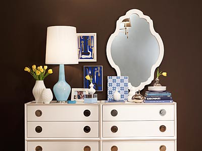
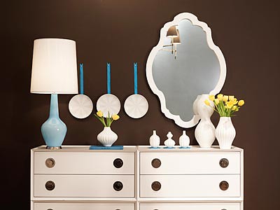
A pair of blue glass lamps anchors either end of the white dresser to establish the tone. Although the lamps are different sizes, symmetry comes through the repeated color.
I balanced the different lamp height by pairing the taller one with a shorter cluster of objects – and vice versa.
Hang plates in unusual locations to fill up white wall space and round compositions.

Here, I grouped numerous items into series of little moments: one book is propped up vertically, like a painting; a stack of plates anchors a bud vase; another vase gets a lift from a Lucite box; etc.

One half of the tableau is arranged symmetrically, the other half is asymmetrical. Look at the overall composition, but break it down into constituent parts.
SOURCE: MSN
Visit his website: Jonathan Adler

No comments:
Post a Comment
HELLO! :) Thanks for taking the time to comment! I love hearing what you have to say. I do reply to comments through email, so make sure you are not a no reply blogger so that I can indeed email you a response back. :) Not sure what a no reply blogger is? Read about it HERE.